Day 5: Data visualization with ggplot2
Media day (week of 2023-10-30)
What is EDA?
EDA stands for Exploratory Data Analysis
EDA is the step of “getting to know” your data
You have already been doing some EDA by sorting the data and understanding what is in each column
What is EDA?
Another very useful tool for EDA is data visualization
Today we will learn how to visualize data using
ggplot2ggplot2is included in thetidyverseset of packages- There are other ways to do this such as using
plot(). Butggplot2has more consistent syntax.
Image by Allison Horst
What makes a good plot?
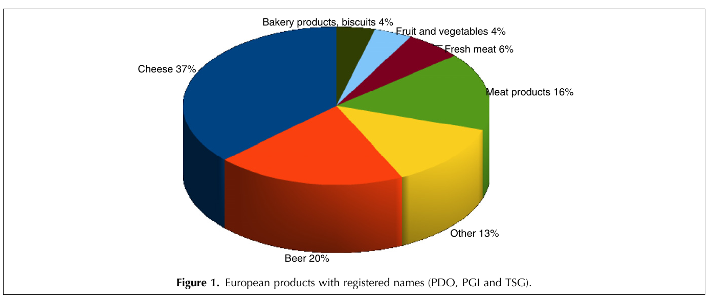
- How about this one?
Problems with this plot
Colors don’t correspond to contents (meat is green?)
3D doesn’t have any meaning, only makes plot more complicated
Hard for humans to visually compare area

What makes a good plot?
Simple
Easy to understand
Conveys a message
What makes a good plot?
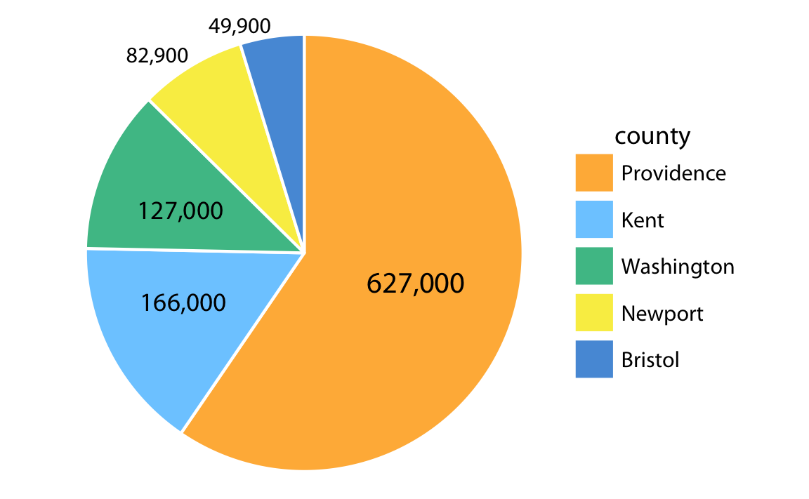
Pie chart
Bar graph
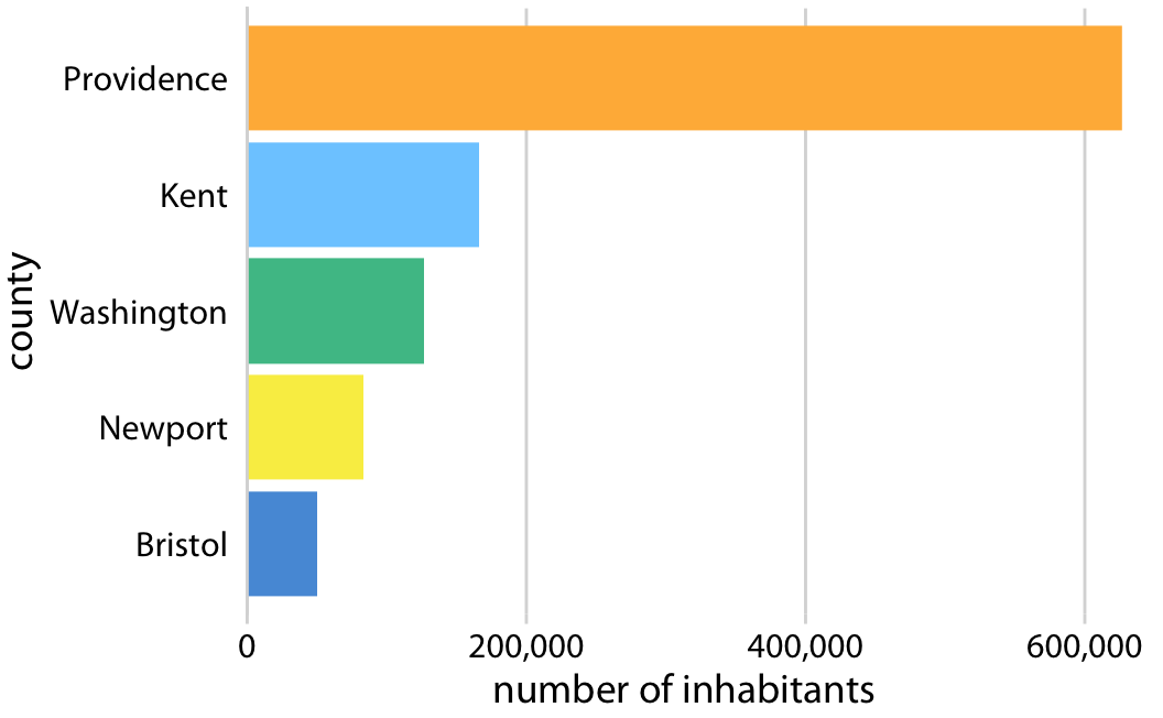
- Bar graphs are better than pie charts for comparing values!
ggplot2 approach to plotting
- Grammar of Graphics: all plots share a common “grammar”
- Input data
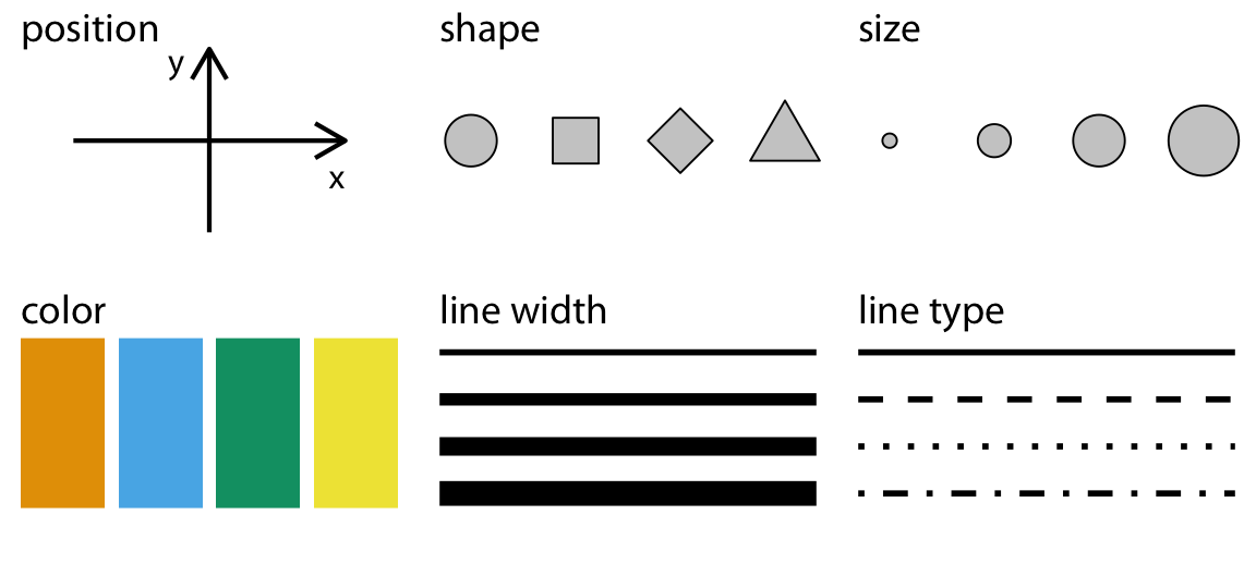
- Aesthetic mapping: How to represent the data visually
- aesthetic = 美的, mapping = 相当する. どんな美的な要素に相当するのかの指定
- Geometry: What shape to use for the plot
- Recommended Reading: ggplot2: Elegant Graphics for Data Analysis
Aesthetic mappings
Pie chart

Bar graph

How is population represented (“mapped”) in each plot?
What is the shape (“geometry”) of each plot?
Pie chart

Bar graph

- How is population mapped in each plot?
- Mapped to area in pie chart, length in bar graph
- What is the geometry of each plot?
- Circle (“pie”) in pie chart, column (“bar”) in bar graph
Reopen your project
We will continue to use the
gapminder-analysisproject in thedata-analysis-coursefolder on your DesktopAlso create a file to write today’s code. You could call it
data-viz-practice.R
Load tidyverse
- Let’s load the
tidyversepackage withlibrary()- Note that you don’t need to use quotation marks for the package name
- Also load the
scalespackage, which is for making plot labels
Load data
- Use the
read_csv()function to load a spreadsheet as a dataframe
Gapminder
This is a dataset of economic statistics from various countries over time, from https://gapminder.org
The meaning of some columns is obvious (
country,continent,year), but not otherspop: PopulationlifeExp: Life expectancy (寿命)gdpPercap: GDP per capita (一人当たりの国内総生産)
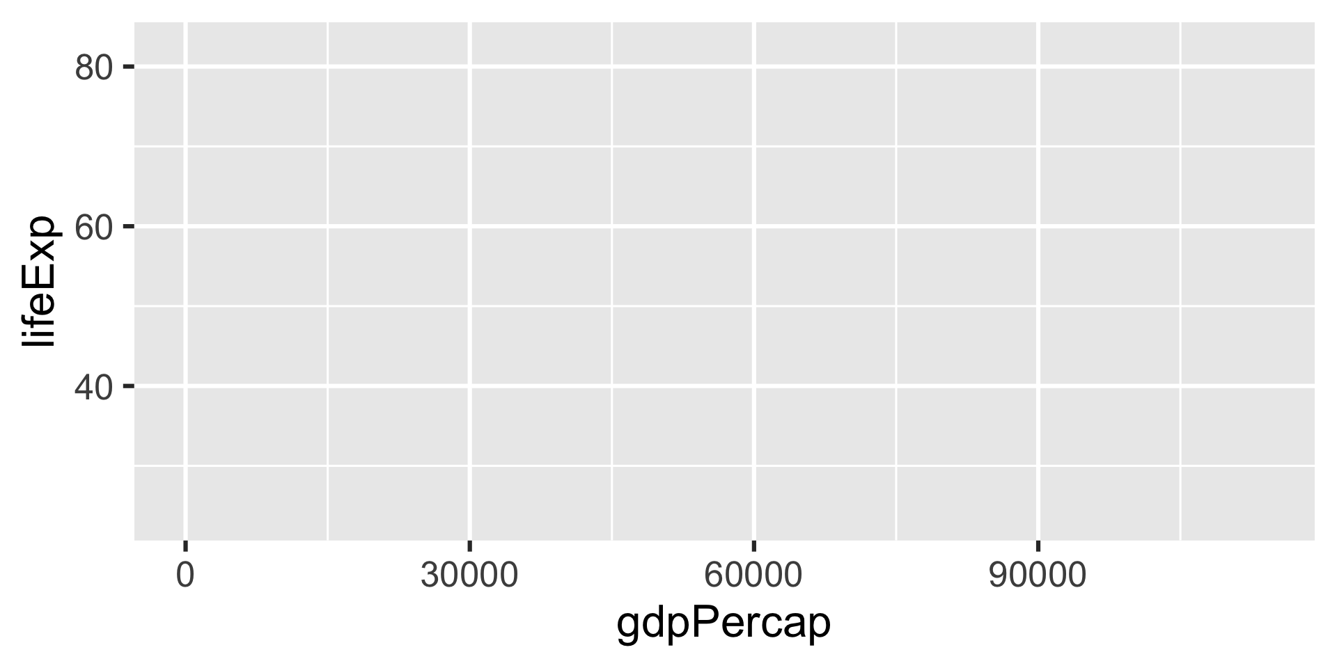
First plot
First plot
First plot
- What does this plot tell us?
Challenge
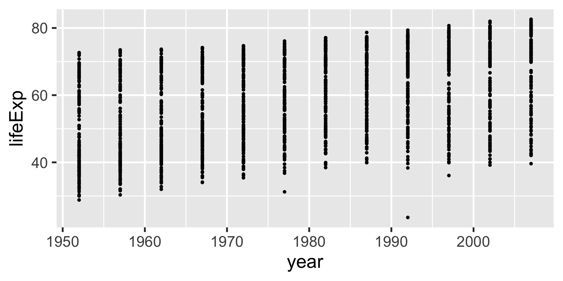
- Modify the code to show how life expectancy has changed over time
Add color
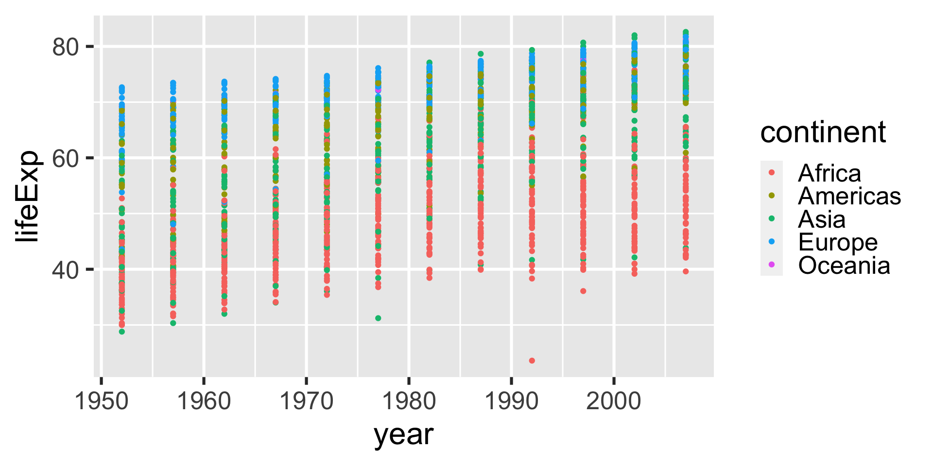
In the last challenge, we saw a general trend, but there could be more detail within certain groups, like continent or country
Let’s use color to show the continent
What is color in
ggplot2?- Color is an aesthetic mapping
Original plot
Add color
Add color
Basic recipe
- All plots can be made using the same basic formula:
ggplot(data = INPUT-DATA, mapping = aes(MAPPING)) +
  GEOMETRY
Basic recipe
- Since
dataalways comes first andmappingsecond, we can omit those names and make our code a little simpler:
ggplot(INPUT-DATA, aes(MAPPING)) +
GEOMETRYPlotting lines
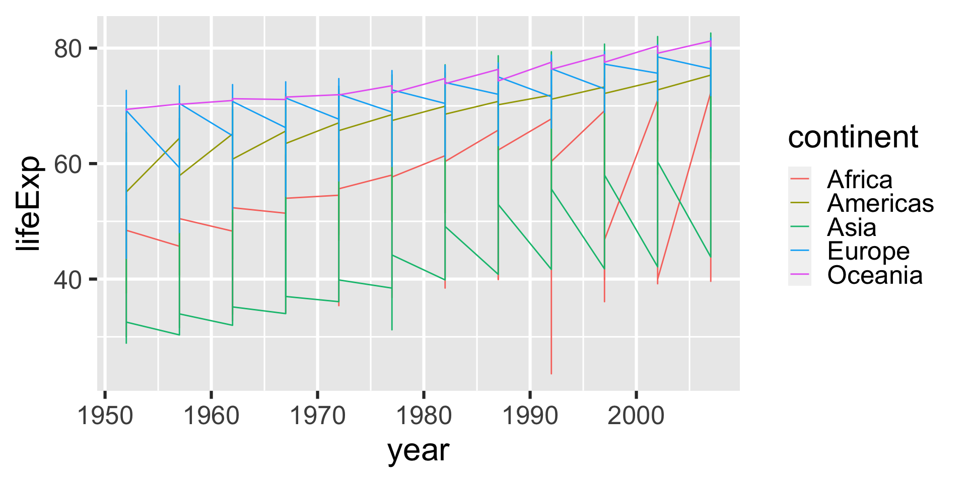
Let’s try representing the data with a different geometry (shape)
This time we will use lines (
geom_line())
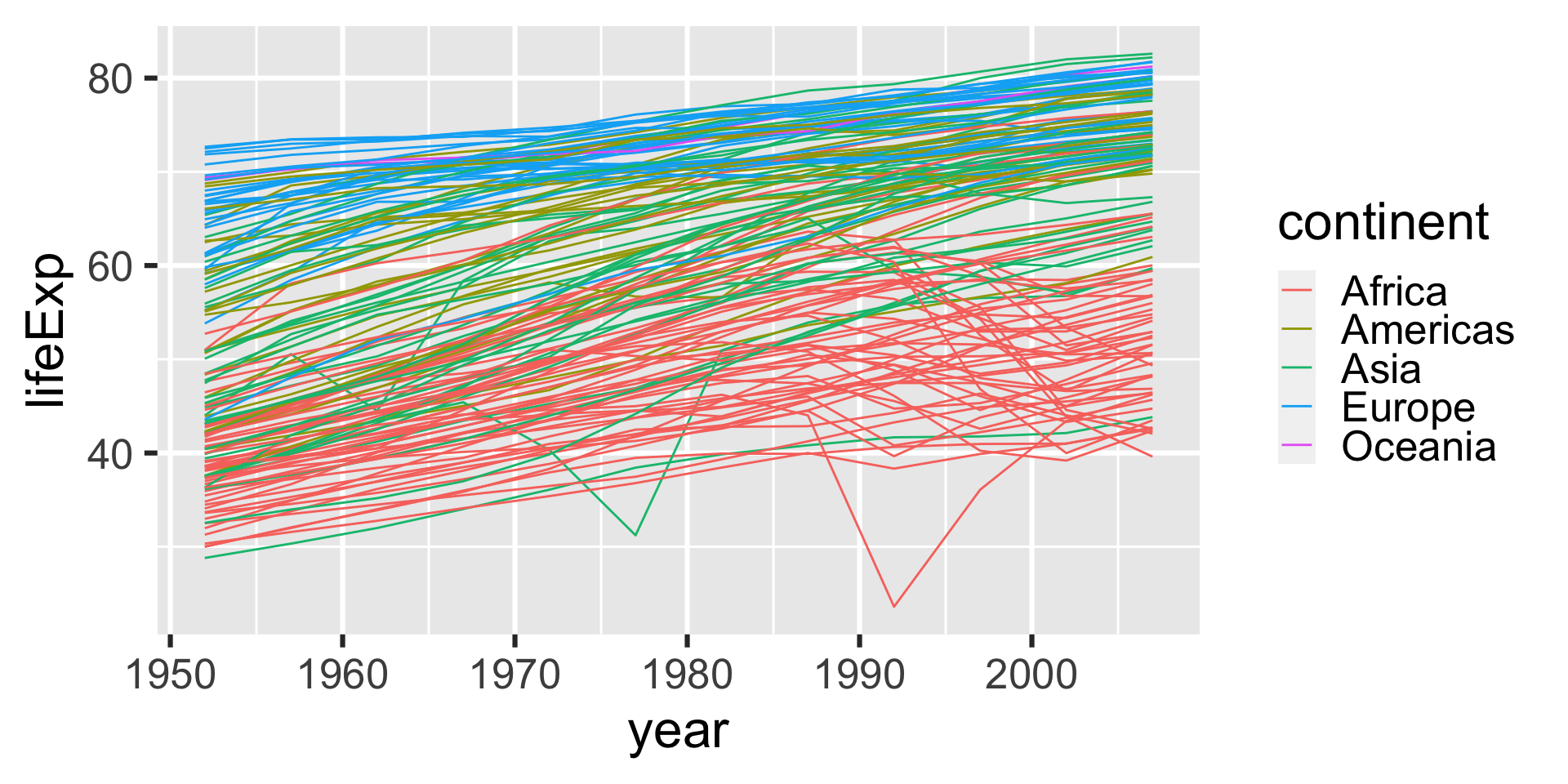
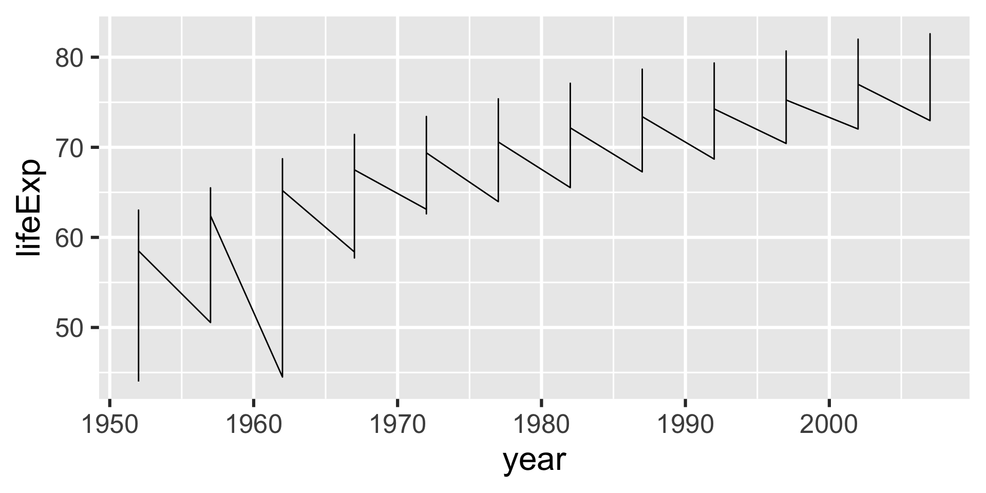
Plotting lines

- That looks a little odd. What is the problem?
Plotting lines
Lines connect points along the x-axis
But we only want to connect points within each country
We need to add another aesthic mapping for that, the
group
Plotting lines
Plotting lines
Plotting lines
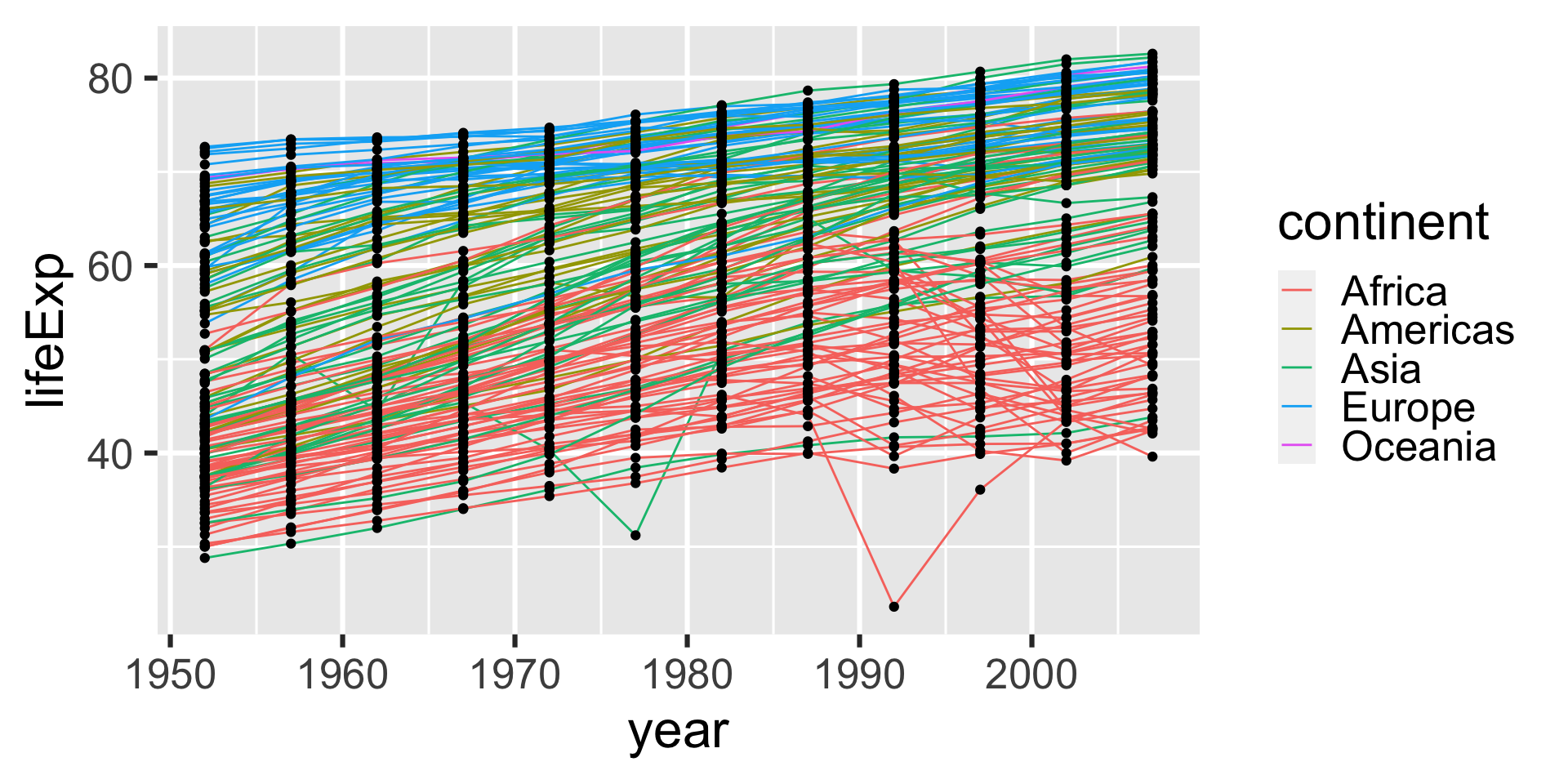
Adding layers with +
We can add additional plot layers using the
+signFor example, lets add points on top of the lines
Adding layers with +
Adding layers with +
Adding layers with +
Challenge
The ggtitle() adds a title to a plot. Use ggtitle() as another layer to add a title to the last plot.
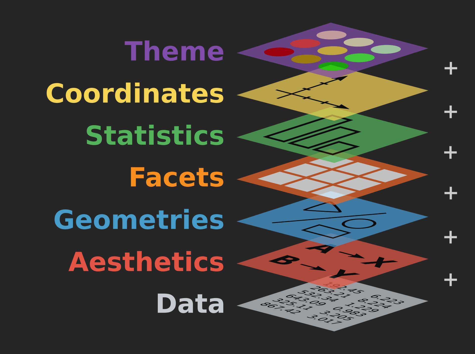
Summary: Adding layers with +
Each layer modifies the plot, so you can build it gradually
Other things layers can do:
- Set the plot theme
- Change the axes
- Add labels
- and more!
Modify an aesthetic
So far, we have been mapping aesthetics to variables in the data
But you can also simply assign the same value to a particular aesthetic (such as color)
Do this by setting its value outside of
mapping = aes()
Modify an aesthetic
Modify an aesthetic
Modify an aesthetic
Transformations
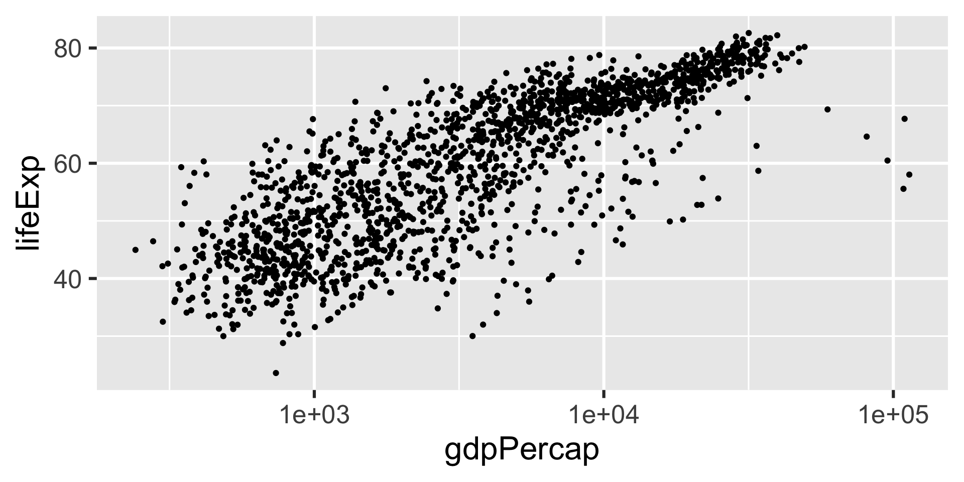
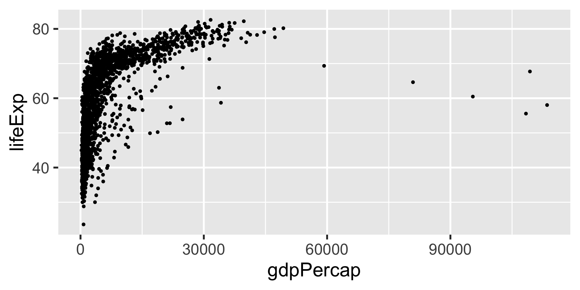
- Let’s go back to the life expectancy vs. GDP graph again:

Transformations
- Do you notice anything that makes this graph hard to read?
Transformations
- Nearly all the points are crowded to the left, with only a few outliers on the right
- We can make this easier to read by using a log-transformation

Transformations
Transformations
Transformations
Transformations
Multi-panel plots
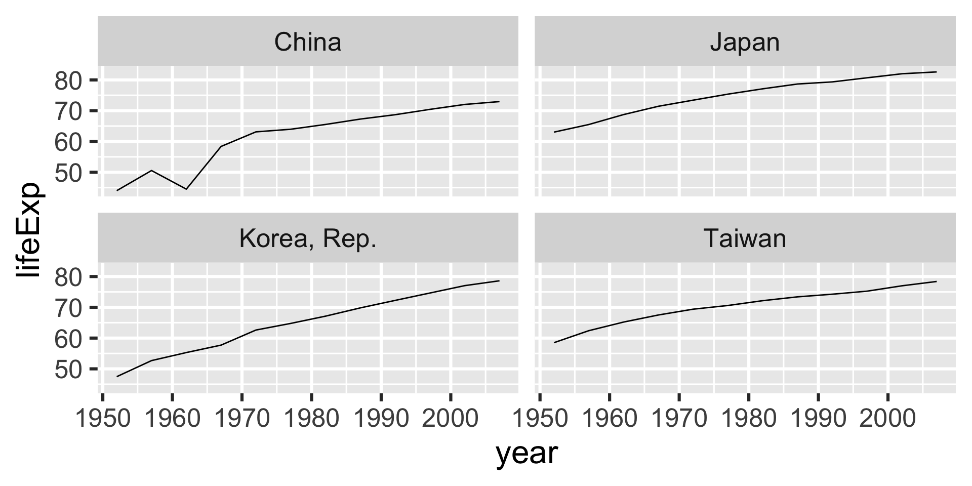
ggplot2can make multiple plots at once using facettingEach facet is a mini-plot of some portion of the dataset
- Define the facet group with
vars()
- Define the facet group with
Let’s try this for some countries in Asia
Multi-panel plots
- First, subset the data just to some countries in Asia (for this example)
Multi-panel plots
Multi-panel plots
Multi-panel plots
Adjusting labels
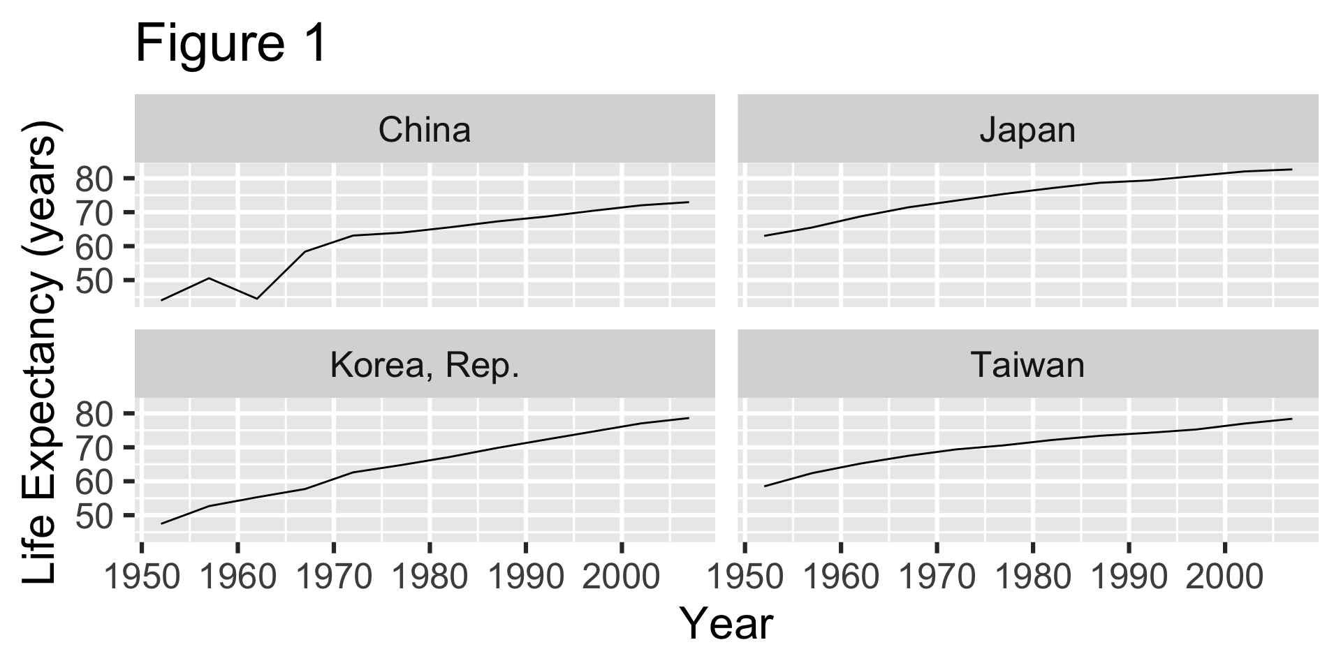
- When you “publish” your plot (this could be including it in a report for a class), it needs to be clearly labeled
- Whoever is reading your report won’t know what “lifeExp” means
Adjusting labels
Adjusting labels
Adjusting labels
Saving your plot
If you need to you can save your plot in R, and write it out as an image file
Use the
ggsave()function
Saving your plot
Saving your plot
- You can also save
.jpg,.png, etc.
Summary
- Think about what you want your graph to show
- Aesthetic mapping: How to represent the data visually
- Geometry: What shape to use for the plot
- Build your plot using layers
- Basic recipe:
ggplot(INPUT-DATA, aes(MAPPING)) + GEOMETRY

